 Take a look at this ad I found today in a magazine. It's for a furnishing/trimmings design company called Kravet. You can get a whiff of this high brow art at http://www.kravet.com/. Be prepared to drool. Man. That's some pretty lavish stuff. Fabrics to die for.
I'm adding this place to my dream of a textile tour of America...
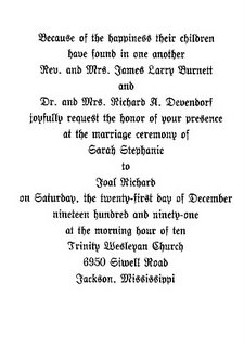
Look what else I found today. This is an invitation to our wedding. I haven't looked at it in quite a while...I was rearranging some boxes and found the box of wedding stuff that I keep...someday I'm going to..you know...scrapbook our wedding. Maybe.
OK Probably not. But this is the invitation. Simple. Very formal. Black raised ink on an ivory card. It was exactly what I wanted. I remember laboring over the font choice and the wording. It was 1991--there weren't as many choices as there are now. Invitations had to be ordered then. Geesh. This sounds like it was forever ago. I guess it was, really.

Anyway, I just thought it would be fun to show you...
So, I'm making this a dare...blog something you treasure...Debby, Tracie, everybody...

7 comments:
wow that site has some gorgeous stuff! thanks for sharing :) and your right I think I was drooling. lol
THANKS FOR THE ENABLER!!!! FANTASTIC STUFF!!!!!!!
Wow! Almost 15 years, that's awesome! You're making me think, but I will come up with something soon. Stay-tuned...
Ok, so not only are you and I the same age, we got married the same year. Too cool.
Lovely ad, I can see the draw.
Funny...my last post was a picture of a treasure. Go see!
Wow - that's a challenge, I'll have to think about it and see what I can come up with.
Beautiful invite btw!
Hey Sarah, I remember choosing my invites.Also married 1991. Mine was light purple with embossed roses and darker purple writing. I still love purple, by the way.Its funny, cause I still love our invites, but the church name was wrong. Nobody would know but me! Funny huh?
Christy
Post a Comment