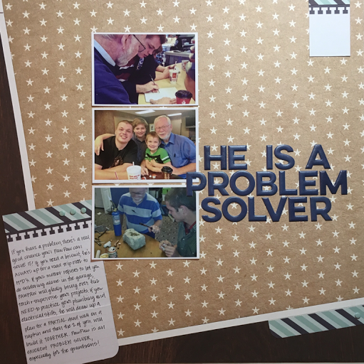
I know, I know.
There are no rules in scrapbooking.
I get it.
Technically, there are no rules...but I've been doing this a while and I know what I like and a few things I don't like so I'm just going to go with it. By personality, I find a bit of safety in rules so I have established Sarah's Rules of Scrapbooking--12 ways to keep my pages cohesive and pleasantly designed.
1. The margin is always on the left. I prefer a page design with a left-based margin. If there's a design element the moves (such as a car or truck), it's front end should be facing the right. If there are words on a banner, the banner should be anchored on the left. If there's a title, it should run from top to bottom and left to right.
2. You can never go wrong with a piece of black and white microcheck ribbon--or a black and white color scheme, for that matter. When shopping for letter stickers, always buy black.
3. The longer the title, the better. I love a good wordy title that draws the reader into the journaling.
4. A scrapbook page needs to tell a story and most of the time, photos do not convey the whole story. Give me the story that I can't see. Write it down.
5. A photo that has a horizon line (such as ocean photos) should always be straight on a page.
6. Letter stickers need to have their centers removed. I can not abide letters that have abnormal middles when they are supposed to be open. Can't do it.
7. Alliterative titles make me happiest.
8. Look for scrapbook inspiration in other forms of media--and when considering a sketch, don't allow yourself to be locked into only using the number of photos shown in the sketch or their orientation. A sketch should be judged on its overall appearance--not just its number of photos.
9. Scrap lift yourself. When you make a Scrapbook page that is something you love, go back and do it again. Scraplift yourself early and often!
10. Back to titles for a moment. A title rarely works on a busy patterned background. If you have to work to read a title, something is wrong. Many times, a difficult to read title can be greatly enhanced by just setting it on a layer of solid cardstock.
11.

