Pages

Showing posts with label stamping. Show all posts

5.01.2019

Layout Share: MARTA and Using a Sketch

Please note: This artwork was originally shared on my stamping blog last year. I'm currently in the process of migrating all the stamping blog posts to this page and removing the links that are no longer relevant. Sometimes that means just keeping the artwork. :)

Close to my Heart offers an idea book filled with sketches for scrapbook pages called Make It From Your Heart Volume III. Previous editions of Make It From Your Heart have been for cardmaking, so Volume III is very special. Each sketch is a double page spread (which I almost never do) and has two full-color example spreads included. Volume III includes sketches for 36 double page spreads. There are cutting guides and measurements included as well. 

These sketches are designed to be used with the most common photo sizes such as 4x6 and 3x4, and include 4 to 8 photos on each spread.  (You know I never use that many photos, so I adjust as I go.)  As you might expect, 100% of the supplies used in the page designs shown in Make It From Your Heart are manufactured by Close to my Heart but it's fairly easy to substitute supplies from other sources.  

As you probably know, sketches are simple recipes for design that can be copied exactly or used simply as a jumping-off point. 

Let’s just be totally honest here—I have a very difficult time following directions of any kind when it comes to scrapbooking, so I tend to use sketches as a jumping off point. I don’t look at the number of photos in a design because I use only 1-3 photos on a page and I basically never create a 2 page spread. So you might ask, do I actually use and like this book?

In a word, YES! Using a sketch as a jumping-off point insures that I know where I’m going creatively and helps me know when I have have arrived. I’m not a literalist...a sketch showing 7 pictures and only a few sentences of journaling in the book can magically and easily feature 1 or 2 pictures and a ton of story on my page. I find that starting with a sketch enhances my creativity by giving me a basic framework from which I can invision my finished page, while allowing me to enhance it with other items I have chosen, such as patterned paper, story, title and embellishments. 

For this layout, I used Pattern 27 from Volume III,  the left side.

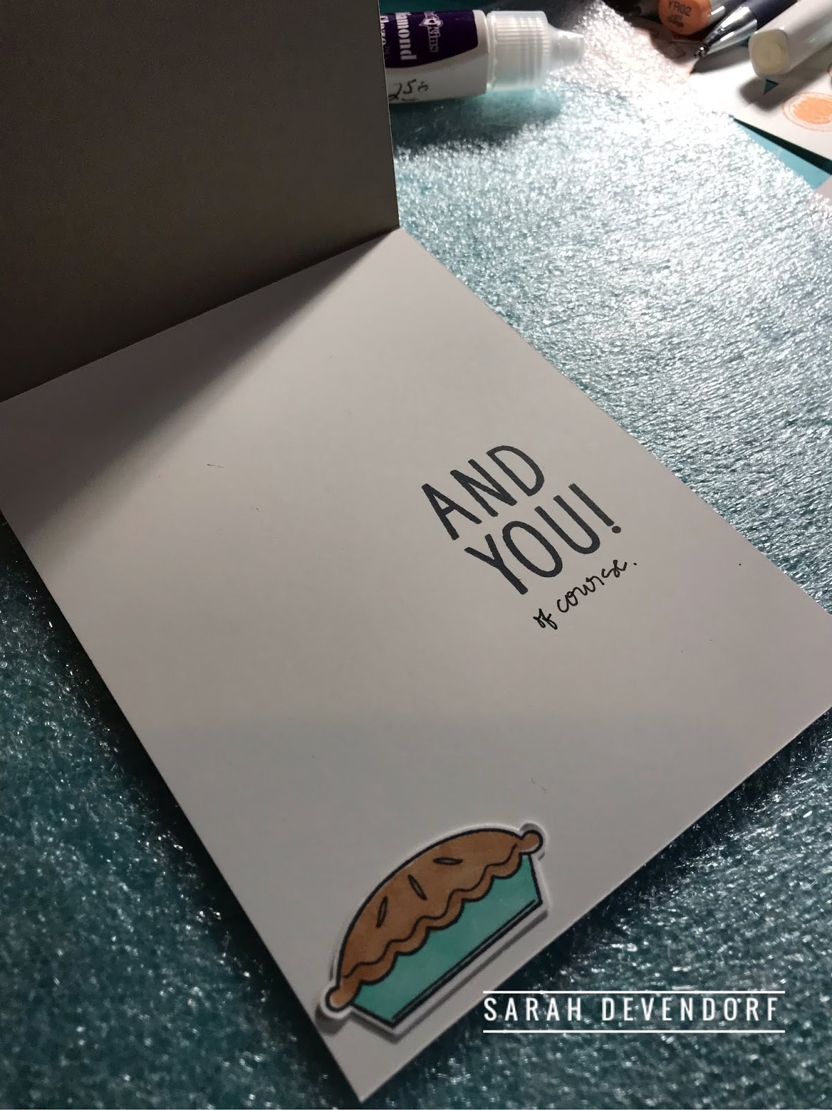
This layout features flowers cut from the Gimme Some Sugar paper and the Marker Alphabet Stamps! I went with the flowers to convey the princess-y feel referenced in the journaling. The card in the upper right corner is the actual MARTA ticket.

Never let your design be locked up by the sketch. Instead, make it your own by:

  • Flipping it around. 
  • Changing up the number of photos. 
  • Adding extra journaling. 
  • Making the page larger or smaller. 
  • Using just the left or just the right side of the design. 

Using a sketch is like wearing a little black dress. You can wear the perfect little black dress 100 different ways because in truth, it’s not about the dress--It’s all about the earrings, necklace, bracelet, shoes and the handbag! Am I right? 😁

Thanks for stopping by. 
Happy sketching,
Sarah 

Patterned Pumpkin Love

Please note that this post originally appeared on ,y stamping blog. I'm currently in the process of migrating all the stamping content to this page. All links that are no longer relevant have been removed.

While I don’t love pumpkin spice beverages, (gasp, I know)  I do love pretty pumpkins! And that’s how it came to be that I held onto this retired stamp set from Close to my Heart called Autumn Wishes. The pumpkin is just so special with all those patterns...it doesn’t even need much embellishment. 

I made this card recently using the pumpkin from Autumn Wishes. I wanted to share this with the Heart 2 Heart Challenges group for the Pumpkin Spice Challenge!

#retiredstamplove 

The sentiment is a tiny little wood-mounted rubber stamp by A Muse Art Stamps, now known as A Muse Studio. I love it because its an appropriate sentiment for so many occasions. Unfortunately, A Muse has undergone several reincarnations since I purchased this stamp and it seems that while they do still offer a very limited selection of wood-mounted stamps HERE, this particular one is retired. :(


Until next time,
—Sarah

To All the Stamps I've Loved Before

Please note that this post originally appeared on my stamping blog last year. I', in the process of migrating all the stamping content to this page and all the links that are no longer relevant have been removed.

The Heart 2 Heart Challenge for this week is to create something that is “inspired by nature”. This challenge is wide open to interpretation—those are the kinds of challenges I love most!

This is my entry—


I’m mixing up all the stamp companies this time—because that how I ike to stamp! #allthestamps

This card was made using a border stamp and a sentiment stamp from Close to my Heart and a wood-mounted stamp from Impress Cards and Crafts that I have loved for years! It’s called Savy Line Flower Cluster. You can see it here.

That skinny stamp of checked border has been my go-to lately...I’m seriously loving it. It’s in a Close to my Heart set called “Holiday Borders” and is now retired. (Retired stamps is a concept I'll never understand. I get so attached to the lovelies.)   I stamped it out in about six different colors and cut them out at a recent crop night. I find hand cutting or “fussy cutting” as some call it, very soothing and relaxing.

In addition to the challenge card, I also created one more card, using the same collection of stamps. That little torn bit of the checked stamp acts like a piece of washi tape holding things together at the top.


Until next time,
--Sarah

Christmas Card Color Dare Chaallenge

Please note that this blog post originally appeared on my stamping blog last year. The links that are no longer relevant have been removed. If you see a product you need, send me an email and I will help you source it.

The COLOR MY HEART COLOR DARE #320 
is to create using to following colors:
-New England Ivy
-Candy Apple
-Kraft

Here’s my answer to the challenge:


I stamped the stripes for a tone-on-tone look. I’m really taken with stamping my own stripes right now and I love that because this stamp isn’t a straight line, I really can’t mess it up. No precision needed.

I used a tiny piece of plaid ribbon for balance as well as a strip of sheet music from a discarded music book.

I love red and kraft together...don’t you?

Happy Stamping!
—Sarah

4.24.2019

Why Does It Work?


Do you ever get on a creative roll and really really feel like you have this thing we call scrapbooking handled like a boss?

Typically, when I experience this feeling it’s because I’ve been dedicated to my crafting process with regularity and have really pushed myself to finish certain projects.

This is one of those layouts—it just works for me. It makes me feel like I have this scrapbooking thing under control!

So let’s ask...
Why does it work?
What is it about this particular design that makes it work for me?

1-The color scheme. Chocolate brown, birdegg blue and lime green sing for me.

2-The title is funky but readable and is unique. I love a title that makes the reader want to know more and I feel like this one does that. I also love a stamped title.

3-There's a specific memory on this page. I love scrapbook pages that capture a memory that I don't think anyone else (namely the boy in the picture) will automatically recall later in life. It's not a monumental moment--it's a quiet memory that could easily be shoved into the background of life unless I write it down. It speaks to who this child is. I like that.

4-This page utilizes a unique accent--a Post it note. That small square of paper with the quotation marks on it is a Post-It note. I love being able to incorporate everyday things (especially office supplies) into my scrapbooking.

5-This page is 8.5x11. I love this size.

Until next time,
--Sarah


4.23.2019

The Pretty Pie Stamp

(This post from Thanksgiving of last year originally appeared on my stamping blog, which is being retired.)

It’s Thanksgiving here in the US...time to acknowledge the good things in life and take a day to thoughtfully embrace gratitude. The  Heart 2 Heart Challenge for this week is to build on the theme of “a thankful heart”.

Here’s my entry into the challenge:


My husband is all about the pie at Thanksgiving. This year we are having an abnormally quiet Thanksgiving at home so I made this card for him. (Paper pies are the only kind I make but I did stop by the bakery and pick up his favorites yesterday.)

I hope your Thanksgiving is filled with pie too!
Until next time,


—Sarah

Spotlighting Techniques--Vellum

To spotlight something is to draw attention to it. 

There are many techniques that paper-crafters use to draw attention to a certain element on a card or scrapbook page. In this previously-shared blog post (from 2018), I have demonstrated spotlighting using velum to create a lightweight visual frame around the element of a card.

Vellum has been a staple in paper-crafting forever and is an easy-to-use specialty paper. It has a variety of uses but perhaps the most obvious is as a frame to give the eye a transitional avenue around something exciting. I use vellum quite often in this manner.

I had to give the Spotlight On Challenge at Heart 2 Heart Challenges extra thought. This is why I enjoy participating in challenges—doing so takes you places creatively. It stretches those crafty muscles.

This time I went super clean and simple using vellum to spotlight the decorative band across my kraft card base. The vellum layer is soft but adds visual weight. I enjoy the impact of repeating images, especially if the color combo is complimentary.


Happy Thanksgiving everyone!
—Sarah

Choose the Blues

This post was previously shared on my stamping blog for a stamping challenge at COLOR MY HEART in 2018.

The  COLOR MY HEART COLOR DARE #319 is to feature the color blue. Can’t go wrong there. Blue comes in so many delicious shades and variations—what’s not to love? I choose blues quite often.

I went with a delicate blue and a basic dark blue to create this stamped card. Blue is my preferred color pallet and I love this pairing. Do you often choose the blues?


Until next time,
—Sarah

All About the Blogs

So I recently had the opportunity to sit down and chat with The Scrap Gals about the state of scrapbooking blogs and where we see blogs going in the future as a scrapbooking tool and also as just one more form of social media. Its always nice to spend a little time chatting with Tiffany and Tracie about topics we care deeply about and have opinions on.

I've been blogging since 2003, mostly about scrapbooking and cardmaking, with a few family adventures thrown in for some fun. The world of scrapbooking and scrapbook marketing is changing rapidly(and has been for a while) and I have felt for a while that blogs just aren't the prime media outlet that they once were. So many--ok almost all the blogs I used to read regularly have gone inactive or been removed.

 I did a little bit of research in preparation for the show and it seems that crafty blogs surged in proliferation about 2004-2010. Since that time, with the influx of additional avenues of marketing via all the different social media platforms, its become apparent that in order to move forward, there are several questions that have to answered by bloggers:

1. Is my blog just a landing pad or a place to store my extended content? Or is my blog my online home where people who want more of my offerings go? Is my blog to be considered the "fall back place" or is it the "primary outlet"?

For me, with 16 years of content already stored right here, I see my blog as my primary outlet. Lets face it--I'm wordy. I enjoy Facebook and Instagram but I have come to realize that I really do prefer the space to show all the pictures and write down all the words and thoughts. I think I got sidetracked as of late because both Facebook and Instagram offer one thing that blogging seems to lack--instant responses.

2. What does it take to remind people to make the leap from a social media platform such as Facebook or Instagram over to a blog page?

To be honest, I'm not 100% sure. I read a ton of scrapbook message boards and Facebook groups and the general answer to this quandary seems to be "entice me". It seems that a blog will only survive and grow a readership if all the other social media platforms used by that writer are pointing potential readers to the home base and dropping crumbs of inspiration for them to follow along the way. Let's be honest--social media users tend towards a very short attention span. (Myself included!) Where it used to be that people were in the habit of going to individual blogs on a regular basis--now it seems that the habit is completely broken and as a blog writer seeking readers, you have to reach out and almost drag people into your blog space. and you definitely have to make it worth their while with usable content and top-quality ideas.

3. Is my blog a marketing tool for my business or a personal pursuit?

Obviously, this is an easy question to answer. I am not selling anything on my blog--its completely about the passionate pursuit of memory keeping and the paper-crafting life. I'm not marketing a creative business, although I do believe that blogging is an obvious and excellent tool for doing so. I'm a student of marketing in general and yes, blogging is a fascinating way to capture stories and share creative content the on the web with people who are like-minded and searching for creative inspiration.

I think there is great value in being a single voice with a blog offering continuity of style and topic. However, for those who are interested in the use of a blog for marketing a creative business, the team approach to content creation seems to be a very popular option that yields productive results. Obviously, having a steady stream of content from multiple creators (each bringing their own following to the fountain) will enlarge one's reach and do exactly what social media marketing was designed to do--expand the reach of everyone. Its simple math.

I have quite a few friends who are direct sales marketers for crafting organizations. The decline in blog readership doesn't seem to have impacted them the way it has the single-voice blog writers. I think perhaps its because they are finding ways to support each other. If all the Close to my Heart demonstrators are participating in a certain blog "hop", then they are all reading each other's pages and yet none of them will be gaining new customers as a result of their efforts...but big high readership numbers make them feel like they are investing their time into something that "works".

4. What exactly is my goal in blogging?

Certainly there are as many possible answers to this question as there are bloggers in the cloud. I see my blog as a tool to log experiences in paper-crafting, document creative pursuits and have a digital record of the things I've done with paper. If blogging is in fact old enough to have an "old-school" style, that's what I want to do.

One voice, one unique experience.
Documented on the internet, with pretty pictures and all the words needed.

In my chat with The Scrap Gals, I was reminded that there is an intrinsic value to having an online, easily-accessible journal of sorts. If something malicious happened to the physical scrapbooks in my home, I will still have the digital format to fall back on. I like that idea imme

The episode of The Scrap Gals podcast will air in a few weeks. You can subscribe for a tiny monthly fee at www.podbean.com/thescrapgals

So where does that leave me?

--Still believing that blogging (for me) is a contribution to the creative universe in which I participate as a maker and a writer.

--Still wanting to preserve memories and crafty pursuits and watching others who are also doing so.

--Combining all my blog content into one single page. This includes the most recently written content that was shared on my stamping blog over the past year. Links that are no longer active will be removed but the creative projects will still be shared.


Welcome to the reboot!
--Sarah


4.19.2019

Retired Stamp Love

Stamping has been a part of my life for more than twenty years. (Do I say this too often?) While I understand the need for our favorite stamp companies to retire stamps and move on to new things, it's always difficult for me to move on, leaving the sets I've come to enjoy creatively or sometimes even parting with them in order to keep my stash manageable. New designs are fun, of course, but saying goodbye-- not so much. 

So with this in mind, I'm going to do something here that I have never seen another consultant do(but how I wish they would)--I'm going to do a regular feature called *Retired Stamp Love* where I go back and create with sets that are retired but still loved. 

Why?
For the sheer love of stamping. :)  

Sometimes I'll pair up retired sets with things that are currently available. Usually retired sets can still be acquired on eBay, or through the many Facebook groups that exist for buying and selling second hand craft items. 

Today, in Retired Stamp Love, I'm playing with the stamps from the Sugar Rush Cardmaking suite by Close to my Heart. This set of stamps and matching dies was available

 Can't go wrong with cute donut stamps, right?

This is the Sugar Rush Cardmaking stamp set made by Close to my Heart back in 2016.

The Stamp images that are outlined in blue are the ones that have coordinating dies. As you can see there are several wonderful, universal sentiment images in this set--that "Happy Birthday" is a great size for making paper ribbon. More on that in a moment. 


I paired the Sugar Rush suite from last year with the Silver and Gold suite that is also retired.

--The two lighter brown donuts are created using second-generation stamped images. This is a good technique to use when you need a lighter color of ink that you don't have. (This happens to me often.) To achieve this look, simply ink up your stamp, stamp the image on cardstock, then immediately without re-inking, stamp it again. The second image will be much lighter than the first. 


Frosted donuts can be made in many color combinations. For the above card, I skipped the stamping steps and just used the dies with cardstock. I did use the sprinkles stamp to jazz it up a bit. 

I happen to think the sentiment in this set that says "Happy Birthday with sprinkles on top!" is just perfection. I really like the font that Happy Birthday is written in. It's perfectly sized for carding and can be added to any card design. 

For convenience, I performed a bit of stamp surgery on this image and separated the Happy Birthday from the rest of the sentiment. They can be now be used together as shown above or individually as shown below.


I wanted to make it easy to incorporate this Happy Birthday sentiment into some future projects, so I took just a few minutes and stamped out some paper "ribbon" strips using the Happy Birthday repetitively. Each paper ribbon is about 1/2" wide and 11" long. When I use these sentiment strips, I will add a matching colored gem or sequin in between each phrase. 

So there you have it.
Retired Stamp Love.

Until next time,
--Sarah

PS This post originally appeared on my stamping blog, which is also now being retired. All no-longer-relevant links have been removed. :) If you see a product you like, email me and I'll try to help you track it down.


No Room for the Story

Stories are super important to me and in my world, stories are basically *the point* of scrapbooking. The story matters! Without the story...well it's just not right (to me). However, as people who love page design, sometimes great blocks of written journaling present a design dilemma--

what's a more appropriate use of real estate--the journaling or the pretty things?

#scrapbookerprobsright

So once in a while, I give in to the designer side of my crafty soul and stick the journaling  in a less obvious place--today it's *inside a flap*. 


Yes, that title is stamped on vellum. 


This reminds me...this is another installment in my "If you can make a card, you can make a scrapbook page!" series. Look again. That flap hiding the journaling is basically a card. 

I used a good bit of vellum on this page. Vellum is so dependable. It is always a good way to give your pages points of contrast. It is so easy to use! There are several things I particularly love about vellum. 1) It's easy to run through the printer. 2) It tears beautifully. 3) It tones down busy or bold patterns. 4) It's an easy way to direct the viewer to look at a specific part of a page. 5) You can stamp on it! 

The stamped title on this holiday layout was created using alphabet stamps and my favorite ink--Momento Tuxedo Black Ink. Not all inks work well on vellum, but Momento certainly does and it's readily available at most craft stores. 

(This post originally appeared on my stamping blog last year and links that are no longer relevant have been removed.)

#stampinginthescrapbook

Merry Christmas!
--Sarah


5.24.2016

Twenty Five Photos on a Single Page


So putting 25 little pictures on a single page layout is no small feat. For anyone. However, for a girl who's specialty is single photo layouts...well let just say this is a miracle!

For years, I have been tirelessly searching for a photo print service that could meet my long list of meticulous expectations and I have been let down so many times. Finally, quite by accident, a few weeks ago I came upon an app called Social Print Studio, available in the App Store.The planets must have been aligned because the prints that arrived on my doorstep a few days later are beyond description! The quality of the paper used to print these photos is over the top sturdy--not that flimsy stuff more often used by on-line printers. The app is so very easy to navigate. The matte finish is the softest and smoothest of any printer I have ever used. Oh my. If you love matte finish photos, you must try this.

The strip photos on this layout are one of the specialty formats offered by this San Francisco-based service. What's not to love. You get *9* strips for $10. Each strip is 1.75"x7". 

I've been focused on stamping lately and it was just too easy to coordinate this stamp from the Stampin' Up! Amazing Birthday along with Watercolor Wash to create the title/journaling block. 


 The journaling is done on Project Life cards from the Becky Higgins Project Life Southern Weddings Core Kit. I have a thing for the soft cozy color palette of this kit but have no use for the wedding theme...so I chopped them up and used them anyway. 

Twenty-five pictures. 
No small accomplishment.
And some stamping too!

It's a good day to be a scrapbooker. ;)


7.06.2015

Making use of photopolymer stamps--an extra tip


Have you ever noticed that the clear index sheet that photopolymer stamps come with can be used in the design process? When deciding if a stamp will fit in a certain space of it looks right, lay the index sheet over your project, placing the image over the spot where you might want it to go.

For example, in the cake project above, the index image allowed me to see that the flags would indeed fit over the top of the cake on the card.

Learn as you go...

9.22.2010

Enlarging Stamp Images

Stamping...I've loved the idea of stamping for a really long time but haven't always been an active stamper, per se. Funny how that works. Stamping certainly goes hand in hand with scrapbooking.


I'm working the rust and cobwebs out from the blogging joints...so if I seem a little lost, you know why. I'm out of practice. The creative side of me is languishing. Sadly.

I purchased this curling wave stamp from A Muse Artstamps last summer and have been looking at it on my desk ever since. It's such a lovely element...it deserves to be used and loved, don't ya think?

I paired it with a HamptonArts Dollar Stamp from Michaels...and did some experimental coloring with the world's most over-priced markers--Copics.


Above is what I ended up with. I'm a firm believer in the rule of threes in design, so I wanted to incorporate the image of the waves on this page more than once...but it seemed a little small. So I stamped it on plain paper and made an enlargement of the image onto white Bazzill using the copier (aka the most overlooked scrapbooking tool around) :)

Enlarged to 200 percent of the original image. Cut out and colored. Happy happy happy.


Here's the stamp next to the enlarged image.

Looking forward to baby-stepping my way into playing with some other images that are worthy of enlarging.

10.27.2007

Scenic ROUTE Cardage

Scenic Route Class today...this is one of the cards we made.

It's a very simple process...just use the 7 Gypsies self-inking stamp to create the squares on a variety of papers. Cut the squares out and attach to the card in a random fashion.

Finished card is 6x6.

Happy Weekend.

10.24.2007

ADS that inspire and 2 Cards.

I have these two advertisements hanging on my desk. I am enthralled with this color scheme at the moment. The Liz ad makes me want to redecorate my bedroom--I already have the chocolate walls, but the linens are lacking. Look at the texture pattern on the duvet cover. And the sheets. I'm cutting leaves out of a Scenic Route paper that look very similar. :)

The Larson-Juhl ad makes me want to be artistic. See the frames. I am so doing this. :)
_________________________________

In other news, I'm totally on a card roll. See! The birthday card is another of the items from that Karen Foster "I Love Bugs" sticker sheet.


5.16.2007

Superman Stamps! of the Postage Variety!


Postage stamps may very well be the world's most overlooked pieces of every day art. I ran across this sheet of postage stamps commemorating the DC Comics last year quite by accident and knew in an instant they would be perfect embellishments for cards and layouts.

With a little image altering--enlarging and printing on kraft paper-- this is what I came up with.

Directions are at MBI, if you are interested.

Check out the USPS website for more possibilities!

The 2Peas writing prompt for the day is to name 3 things that are on your desk that shouldn't be there. Easy breezy.

1-PVC pipe fittings (confiscated from someone who thought they should be thrown at his brother)
2-half a dozen CDs...because we all knowthat CDs should be put away promptlyinto the CD closet. (snort)
3-a partial glass of Diet Coke. Which wouldn't be bad but it's been here for 2 days. I think I'm going to go take care of that now. LOL!

May all your mail be artful and all your bugs be ladies!

Happy Wednesday!

PS I also have a post on variety (using the same supplies in 7 different ways--7 cards) at MBI here.