Pages

10.23.2017

The Pink Exploded

This has nothing to do with scrapbooking or cardmaking and everything to do with craftiness and pretty pictures. I hope you enjoy.

These are a few photos of the decor prepared for the worship event presented by the women's ministry at my church-- Bethel last Tuesday.

The theme "Radiant" was derived from the book by the same name, written by our special guest speaker, Marian Jordan Ellis. The color scheme was black and white with touches of gold and fuschia. 


I found these gold hammered pencil cups at Target! 


Ugh oh. Man down. 😆


I had hoped to use only Gerbera daisies but the budget did not allow. 


Just inside the doors, we had two special areas. The first table was a place for our ladies to visit to write notes to the mothers of two young daughters of our church who are currently battling cancer. 


The second table was for our guest--Marian Jordan Ellis to visit with attendees and sign her books after the session.

The 12 tables were covered with black table cloths and fuchsia overlays with a centerpiece in the middle of each table. 


At each place at the tables, a take-home gift was laid. Inside the sack was a journal for note-taking and a pen, tied with a ribbon and a tag, as well as a print that featured the scripture verse for the evening. 


A handmade cookie was also laid at each place. (How did I not get a close-up picture of the cookies!?)


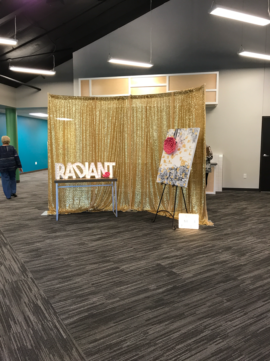
In the foryer we constructed an area for taking photos and I'm happy to say that quite a few of our ladies participated in this. The sparkly gold sequin backdrop set The tone for the evening and was an attention-grabber from the doorway. We used brightly lit Heidi Swapp Marquee Love letters to spell out the word Radiant in the photo area as well as a painted canvas and bold pink flowers for accents.


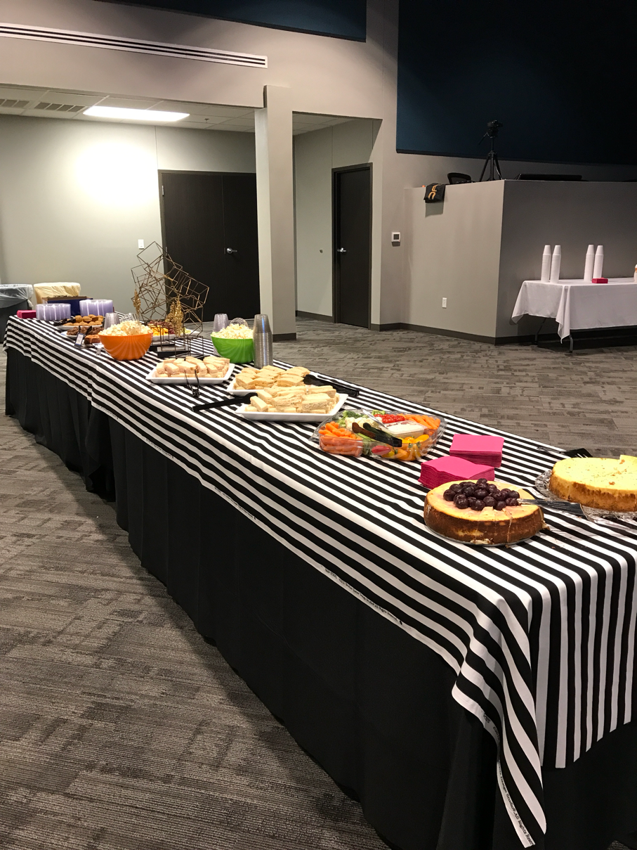
Back inside the sanctuary, the snacks were placed on a long line of tables that could be accessed from both sides. The tables were covered with a black table cloth and a black and white striped runner.


Oct 17, 2017

The Pink Exploded

A few photos of the decor prepared for the worship event presented by the women's ministry at Bethel last Tuesday. 

The theme "Radiant" was derived from the book by the same name, written by our special guest speaker, Marian Jordan Ellis. The color scheme was black and white with gold and fuschia. 


I found these gold hammered pencil cups at Target! 


Ugh oh. Man down. 😆


I had hoped to use only Gerbera daisies but the budget did not allow. 


Just inside the doors, we had two special areas. The first table was a place for our ladies to visit to write notes to the mothers of two young daughters of our church who are currently battling cancer. 


The second table was for our guest--Marian Jordan Ellis to visit with attendees and sign her books after the session.

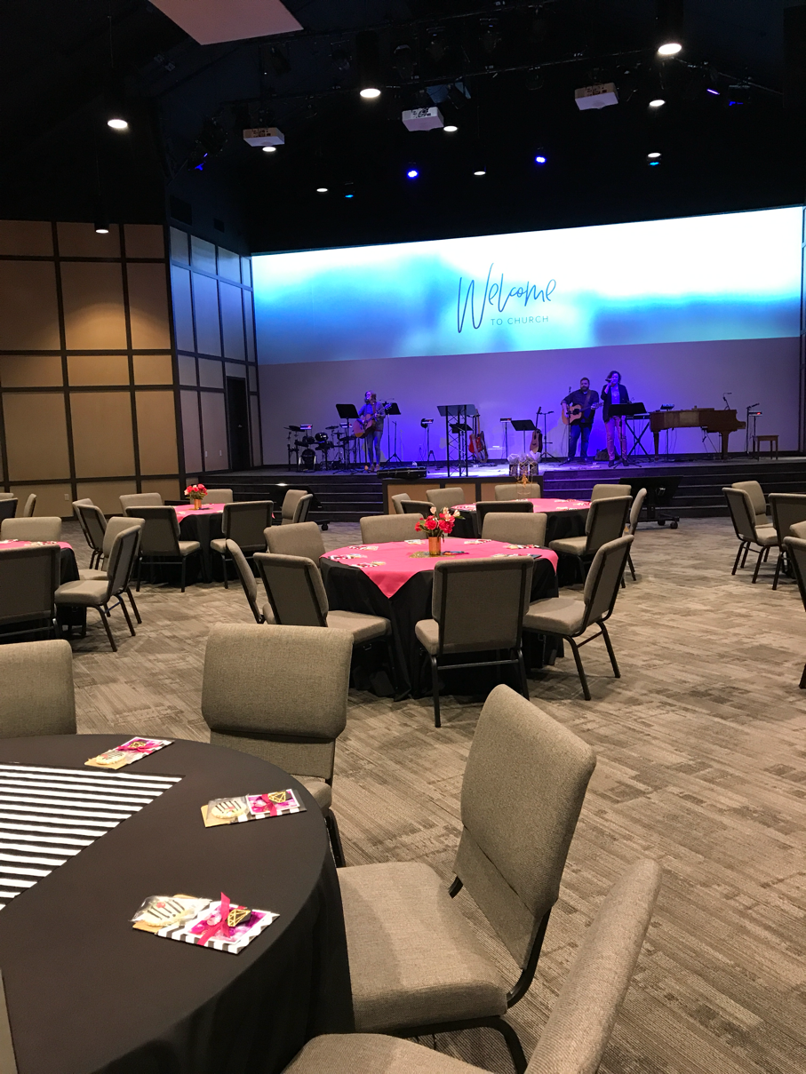
The 12 tables were covered with black table cloths and fuchsia overlays with a centerpiece in the middle of each table. 


At each place at the tables, a take-home gift was laid. Inside the sack was a journal for note-taking and a pen, tied with a ribbon and a tag, as well as a print that featured the scripture verse for the evening. 


A handmade cookie was also laid at each place. (How did I not get a close-up picture of the cookies!?)




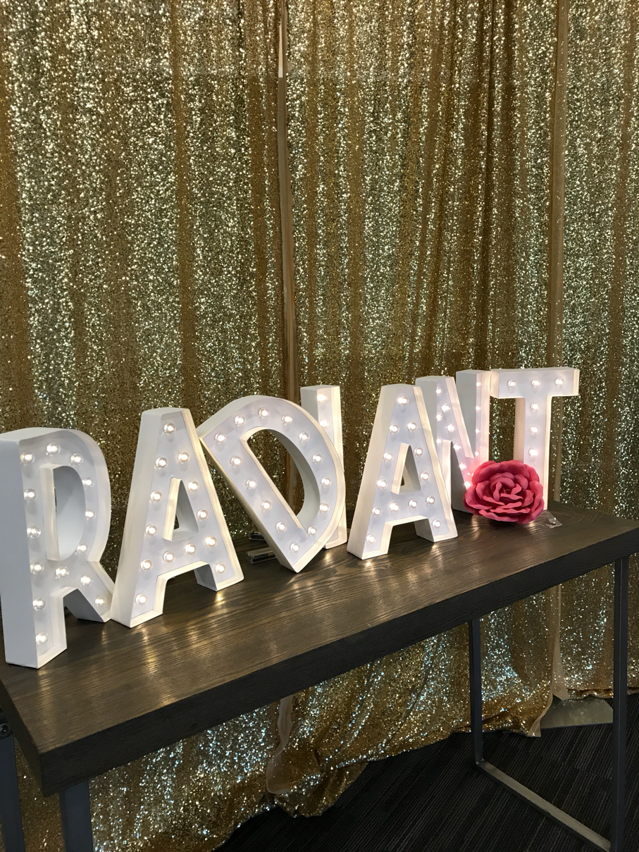
In the foryer we constructed an area for taking photos and I'm happy to say that quite a few of our ladies participated in this. The sparkly gold sequin backdrop set The tone for the evening and was an attention-grabber from the doorway. We used brightly lit Heidi Swapp Marquee Love letters to spell out the word Radiant in the photo area as well as a painted canvas and bold pink flowers for accents.


Back inside the sanctuary, the snacks were placed on a long line of tables that could be accessed from both sides. The tables were covered with a black table cloth and a black and white striped runner.


Oct 17, 2017

10.15.2017

Visiting the Dallas Arboretum

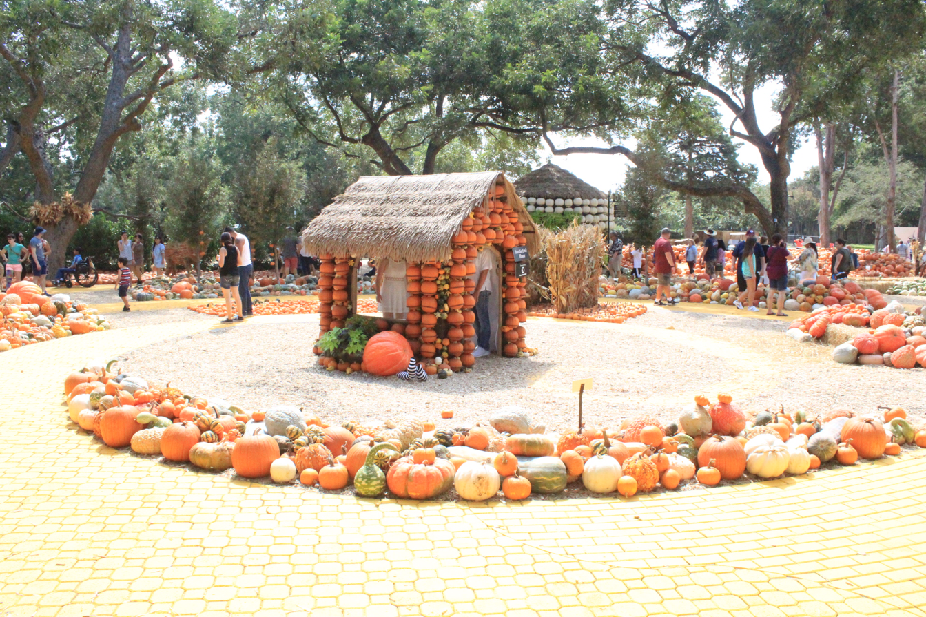
In the fall of the year, the Dallas Arboretum is transformed into an orange and yellow and grey and white wonderland of Pumpkins! Forty thousand pumpkins--every variety imaginable are stacked and assembled and arranged and propped and piled in the most delightful way to create a massive fall festival feast for the eyes. 

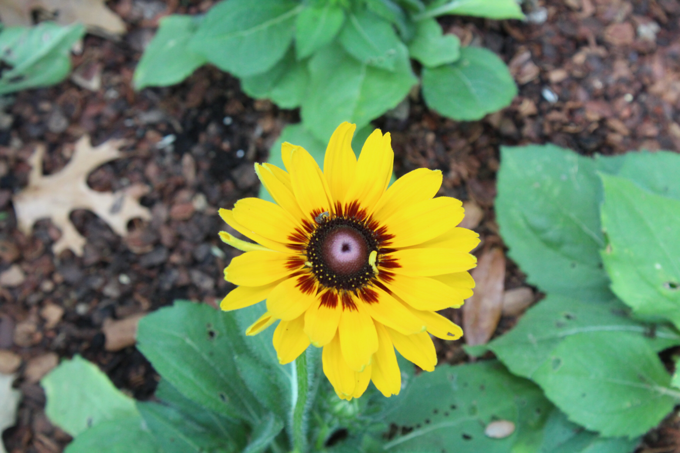
My sister and I both love all things fall, so we attended the Opening Day of The Pumpkin Festival this year. Here are some of the sights we enjoyed.


4.17.2017

Scrap the Boys Challenge

So I ran across a neat Australian blog called "Scrap the Boys" and couldn't help but participate in the April challenge there. I mean...#boysaremylife. 

The challenge was to document multi-generational pictures. 


You can read Scrap the Boys at http://scraptheboys.blogspot.com

I'm enamoured with the rather-sizable navy blue puffy alphabet stickers from Pink Fresh Studios. They are so easy to use and #hellonavyblue. 

I needed more room than one journaling card allowed to tell the whole story so I did a little cut-n-paste on it, making it just long enough for my story. (Journaling cards are from a Project Life kit but I have no idea which one.) 

--sarah

4.07.2017
Sarah's Rules of Scrapbooking

I know, I know.
There are no rules in scrapbooking.
I get it.
Technically, there are no rules...but I've been doing this a while and I know what I like and a few things I don't like so I'm just going to go with it. By personality, I find a bit of safety in rules so I have established Sarah's Rules of Scrapbooking--12 ways to keep my pages cohesive and pleasantly designed. 

1. The margin is always on the left. I prefer a page design with a left-based margin. If there's a design element the moves (such as a car or truck), it's front end should be facing the right. If there are words on a banner, the banner should be anchored on the left. If there's a title, it should run from top to bottom and left to right. 

2. You can never go wrong with a piece of black and white microcheck ribbon--or a black and white color scheme, for that matter. When shopping for letter stickers, always buy black. 

3. The longer the title, the better. I love a good wordy title that draws the reader into the journaling. 

4. A scrapbook page needs to tell a story and most of the time, photos do not convey the whole story. Give me the story that I can't see. Write it down. 

5. A photo that has a horizon line (such as ocean photos) should always be straight on a page. 

6. Letter stickers need to have their centers removed. I can not abide letters that have abnormal middles when they are supposed to be open. Can't do it. 

7. Alliterative titles make me happiest. 

8. Look for scrapbook inspiration in other forms of media--and when considering a sketch, don't allow yourself to be locked into only using the number of photos shown in the sketch or their orientation. A sketch should be judged on its overall appearance--not just its number of photos. 

9. Scrap lift yourself. When you make a Scrapbook page that is something you love, go back and do it again. Scraplift yourself early and often!

10. Back to titles for a moment. A title rarely works on a busy patterned background. If you have to work to read a title, something is wrong. Many times, a difficult to read title can be greatly enhanced by just setting it on a layer of solid cardstock. 

11.